Have you ever been on a social media page where you are just completely transfixed? You just keep scrolling and scrolling DOWN the timeline. You want to stop, but you can’t, with each post and each video, you think “wow”, the pictures seem to be speaking to you on a very personal level, and you are just drooling because you can relate with the overall aesthetic of the brand.
Well yeah, it happens to ALL of us. The thing is, some people sabi this ‘brand’ thing well, some, without even realizing the science behind their art and why it works.
There are so many factors that contributes to a wavy social media page, and those factors depend on which social media platform, it’s features and what it allows you to do with your content. The basic factor we are gonna consider though, are colors, how they can literally speak on the level of sauce of your brand and also how relatable it makes you seem to the myriad of personalities watching your page.
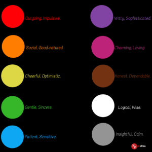
So basically how colors, especially the shades of colors (very important, cause it defines the intensity of the personality trait you are communicating) affect the perception of your social media page. Okay, so to narrow it down, I’ve chosen 10 standard colors, we will look briefly at what they say to your followers and how they can be easily manipulated to represent your brand.
Some people stick to one or two shade (s) of color because they are trying to appeal to a particular target audience, the idea is to strengthen their perception as a particular personality, this ideology works to some extent. I mean it’s fine, as long as conversions is not your goal for social media, if you are an EFCC or a NYSC who just want to pass along information then that’s fine. If you want to get on the social media wave though and you want engagements, you will have to come correct and ready to play.
I will give you an example, Balmain is known as a premium brand right? Their general theme is black, which represents ‘refinement’ and ‘intelligence’, they mix it in with other elite colors like gold and silver, and generally the rich who live lavish flock to Balmain.
Take a look at Balmain’s Instagram page though. It says something entirely different.
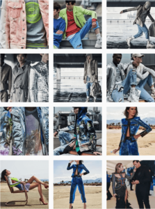
Those colors jumping out at you is strategic and intentional. The goal is to appeal to as many myriad of personalities as possible, maybe not to generally buy their merch (cause obviously not everyone can afford Balmain), but to increase the reach and visibility of the brand.
A Nigerian brand that does it perfectly is Wizkid, go and compare Wizkid’s page with any other Nigerian artiste, you will see a gaping difference.
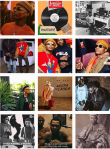
He is not afraid to play with colors, it shows in what he wears, his foot wears, his accessories, even the filters he uses, and of course how he is able to combine these colors without looking like a KCee. When you scroll through Wizkid’s page, you are just lost in the sauce. Shout out to his stylist.
As a brand that is interested in increasing social media visibility and engagements, the takeaway from this is to study the psychological color chart, and to pick those colors that really speak to your brand’s personality and weave them into the fabric of your content. So that’s your fonts, the elements in your creative and also the outfits on the people on your page.
A quick one to note is to be mindful of the intensity of the colors, too loud and it appears tacky. Then in the case where you may want to make a particular color loud, ensure you tone it down with a more subtle color, see how Wizkid’s loud red t-shirt in the screenshot above, was toned down with black and brown?
Let’s engage and not blind our followers please.??