
Have you ever actually wondered why we have to wear clothes as humans? Or what would be of the world if everyone was walking about in their birthday overalls? Big ups to the soul that invented clothes for saving us the horrors we would have faced if clothes were nonexistent and we all had to adorn our bodies with banana leaves!
Apart from protecting ourselves from the weather and the elements, wearing clothes also serve both functional and aesthetic purposes.
Most people wear clothes to hide their privates. Cos they’re shy.
Folks wear clothes to avoid society labelling them as crazy or mad.
People dress up to impress – bosses, clients, and someone of romantic interest.
Some humans also wear clothes to make a statement. e.g. I. HAVE. ARRIVED.
Generally, the way a human is dressed, affects how they’re ‘seen’, perceived and how they are engaged or related with by other humans.
Now think about products, services and businesses: What dressing, clothing, physical grooming means to humans is what BRANDING means (mostly) to products, services and companies! Clothing (read BRANDING) is important… To humans and to businesses.
‘Clothes’ and ‘dress sense’ as used here can mean different things from ‘brand attributes’, to the ‘culture’ of a person, people, place or thing.
Doctors and scientists love to wear white coats.
Engineers love to wear blue overalls.
Firemen love red.
Food companies love combining orange/red/yellow! Have you ever wondered why?
Could it be that it’s because these are the colours of ‘ripeness’, and the human mind (at basic level) still is psychologically wired like the caveman who identified ready-to-eat fruits by their colour?
Green (dark) = unripe. Hard, sour, not tasty. Yuck!
Orange, yellow, red = ripe. Soft, succulent, delicious! Yummy!
The point is… branding is necessary. If for no other reason than to get people to see you in a way you want to be seen.
Now, we’ve said all that just to say:
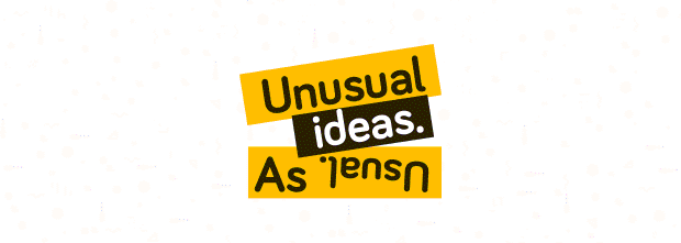
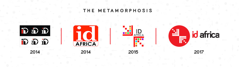
This week, we did a refresh and updated the brand identity of our dear little agency!
After 2 years+ of wearing the old look, we decided to switch up and give ourselves a sexy makeover.
![]()
The ID Africa logo is the most important element of our identity – a graphical interpretation of the brand.
We must treat it with respect.
The logo is a universal signature across all ID Africa communications, that guarantees a quality that unites our diverse messages, products and services.
IDA Logo Elements
IDA promises to connect brands and individuals with the people they care about.
- Top Arrow:
The top arrow represents these ‘people’ – consumers, customers, users, audience, stakeholders, etc., that the ‘brands and individuals’ care about.
Whoever it is that the marketing message or communication materials are targeted at.
With creative content, sexy platforms, smart communication and effective promotion, IDA ensures that the top arrow is drawn to the bottom arrow.
- Bottom Arrow:
This represents ‘brands and individuals’ that we serve – clients, friends, family, plus the message, product or idea that they are offering.
With an understanding of consumer behaviour and the marketplace, as well as use of digital tools and creative marketing communication techniques, IDA will tell the stories that need to be told, so as to achieve desired objectives.
- Top Arrow’s Cubes:
What do people in the top arrow want? What do we promise them? (10 Outputs and Outcomes)
- Entertainment
- Information
- Guidance
- Solution
- Convenience
- Appreciation
- Fun & Delight
- Value for money
- Respect
- Power
- Bottom Arrow’s Cubes:
What do people in the bottom arrow want? What do we offer them? (10 of Our services)
- Strategy
- Assets development
- Design
- Content marketing
- Advertising & Promotion
- Research & Analysis
- Sales
- Relationship management
- Community management
- Creative communication
- The Circle:
This represents our global-thinking.
Even though we are a Lagos-born agency, the quality and standard of our work is international, while our corporate ambition is global.
- Primary Colours:
Red – We’re a youthful, exciting and energetic team with bold ideas
Black – We are African, with deep connection to our roots – Lagos, Marketing, PR and Urban Youth Culture.
- Secondary Colours:
Green – We are passionate about brand growth and sustaining brand health
Blue – We are a strong, dependable team of creatives and storytellers
Yellow – We offer solution to every problem with clarity of thought and optimism.