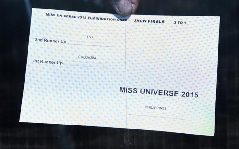
Digital Tutors have blamed Steve Harvey’s wrong announcement at the Miss Universe 2015 on the change in font alignment, size and format.
After examining the actual cue card, it would seem its creators could have benefited from an introduction into basic design fundamentals. The unfortunate gaff highlights how bad design interferes with communication…
You can see the designers placed the all-caps “MISS UNIVERSE 2015” below the names of the runner-ups. The actual winner is right-aligned, so there’s a break in consistency for Harvey as he reads the names.
One of the most obvious problems with the cue card’s copy is the choice to call the pageant winner, “Miss Universe 2015”. Why not just put “Winner” in bold text?
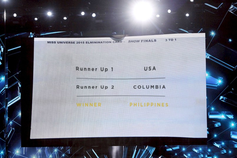
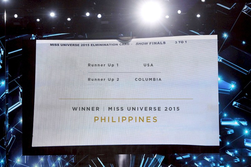
Rather than just point out mistakes and play the blame game, Digital Tutors produced 2 prototypes of how the cue cards should have been designed. See pictures below.
What do you think Designers?